Back to 2014 President's Collection
2014 The Stampede
-

Theme:
"More to it..."School:
J.W. Mitchell High SchoolAdviser:
Sabrina SchmitzEditors:
Natalie Capshaw, Baylor CherryWalsworth representatives:
Missy Green, Adam Livesay, Tracy de la FeuilliezAwards:
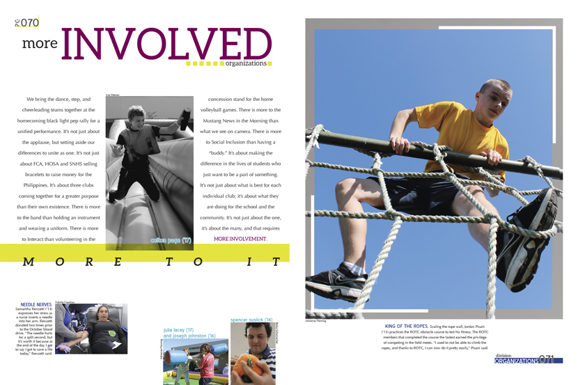
CSPA Silver Crown, NSPA Pacemaker FinalistWith the 2014 edition of The Stampede, the J.W. Mitchell staff wrote that these days students “have found ourselves spending our time taking selfies and posting statuses about what we had for breakfast.” But when you look closer at Mitchell, there’s “more to it.” The Stampede illustrated that there was more going on in the big picture at Mitchell with eye-catching design choices, including images that overflow the frames, interesting headline fonts like andarhillo, and the use of black and white photos to, as the editors put it, “show that there can always be more to what is seen.”
Cover
-

Pages 2-3
-

Pages 28-29
-
Pages 70-71