When you’re building a yearbook spread, size matters more than you might think. One oversized photo can throw off the balance. A headline that’s too small can lose its impact. Good design lives somewhere in the middle – that sweet spot where everything feels just right. That’s what we call the Goldilocks of Spread Design.
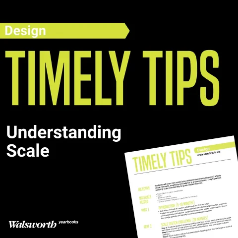
This week’s Timely Tips challenges your staff to experiment with scale, the design principle that shapes visual hierarchy and focus. Students will learn how adjusting size relationships can turn an average layout into one that flows naturally and draws the reader in.
Rethink how size tells the story
Every element on a page has a job. The dominant photo introduces the story, while smaller images and captions add details. Headlines, quotes and graphics should guide the eye instead of competing for attention. When the scale feels off, the story gets lost.
Ask your staff to step back from the screen and look at their design as a reader would. What grabs attention first? Where does the eye travel next? Those answers reveal whether the balance is working or if something might be stealing the spotlight.
Experiment until it feels “just right”
Design isn’t one-size-fits-all. Encourage students to sketch several versions of the same spread, adjusting photo and text sizes each time. One layout might feature a huge image that dominates the page. Another might rely on smaller visuals with a bold headline carrying the weight. Through trial and error, students begin to understand how scale affects movement, pacing and storytelling.
This hands-on approach eliminates the guesswork in design. Once students see how subtle shifts change the overall feel, they’ll gain confidence in making intentional choices.
Learn from real-world examples
There’s no better teacher than strong design. Have your team explore the Walsworth Theme Gallery and study how other schools handle scale. Notice how some spreads make a single image command attention while others rely on repetition or contrast to guide the reader.
Encourage discussion: What makes each design effective? How does size set the tone? What can your staff borrow or improve on? The more they analyze, the stronger their instincts become.
Design decisions that matter
Great design doesn’t shout. It guides. It gives the viewer space to breathe and understand the story. When your staff masters scale, their spreads will feel deliberate, polished and easy to read – the kind of pages that invite readers to linger.
Let’s get started
Learning scale is about control, not perfection. It’s the difference between a layout that feels random and one that feels right. This week’s Timely Tips offers a quick classroom activity to help your students test, tweak and find their balance.
Interested in more ideas on how to sharpen your staff’s design instincts? Connect with your Walsworth representative to learn how we can help your team elevate their visual storytelling this year.