
Book Organization

Help Your Staff Learn the Language of Yearbook
Help your yearbook staff build a shared vocabulary with Yearbook Lingo videos and activities that teach essential terminology and strengthen communication.

Help your yearbook staff build a shared vocabulary with Yearbook Lingo videos and activities that teach essential terminology and strengthen communication.
If you are looking for a clear direction for your next yearbook, this is it. Our newest trends video series with Walsworth’s Senior Graphic Designer Stephanie Zeman, breaks down what is working in yearbook design for 2027, what is fading out and how staffs can make smarter creative decisions without overcomplicating the process. This four-part series breaks down the following topics with short, engaging content: What Makes a Good Yearbook Theme Universal
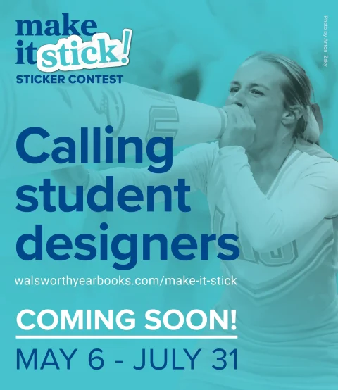

If you’re the student who loves designing yearbook spreads, creating graphics for your staff or sketching designs just for fun, something exciting is coming your way. Walsworth is getting ready to launch Make It Stick, a student sticker design contest designed to celebrate creativity and give student designers the chance to win cash and see their artwork featured in the
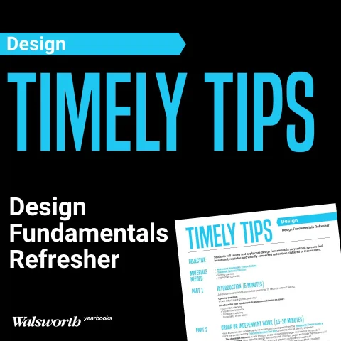
As the year moves forward, you may notice subtle shifts in how your staff approaches design. Spreads may start to feel busier than they did earlier in the year, and students often respond by adding more elements instead of stepping back to reconsider the layout and how the design carries theme. If that sounds familiar, you are not alone. This is a common point
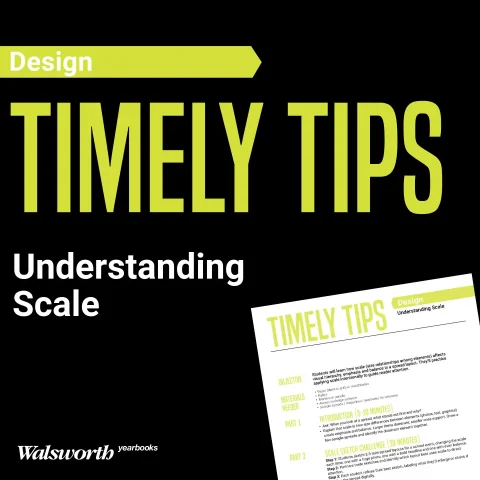
When you’re building a yearbook spread, size matters more than you might think. One oversized photo can throw off the balance. A headline that’s too small can lose its impact. Good design lives somewhere in the middle – that sweet spot where everything feels just right. That’s what we call the Goldilocks of Spread Design. This week’s Timely Tips challenges
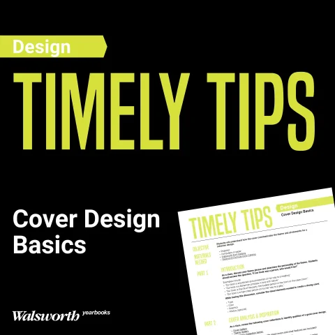
Starting a yearbook cover from a blank slate can feel overwhelming. With no lines to follow, it’s easy to freeze up or fall back on safe choices from previous years, but the cover is too important to play it safe. It sets the first impression, introduces the theme and convinces your audience to open the book. That means every design
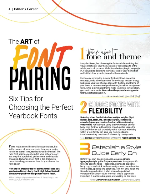

Fonts might seem like small design choices, but in the context of your yearbook, they play a major role in its overall tone, readability and cohesion. The right font pairings can help tell your school’s story in a way that’s polished, professional and visually engaging. But when every font in the dropdown menu is calling your name, how do you
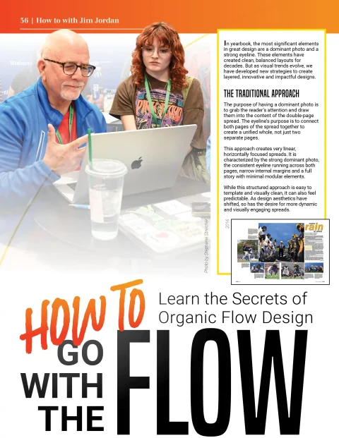

In yearbook, the most significant elements in great design are a dominant photo and a strong eyeline. These elements have created clean, balanced layouts for decades. But as visual trends evolve, we have developed new strategies to create layered, innovative and impactful designs. The Traditional Approach The purpose of having a dominant photo is to grab the reader’s attention and
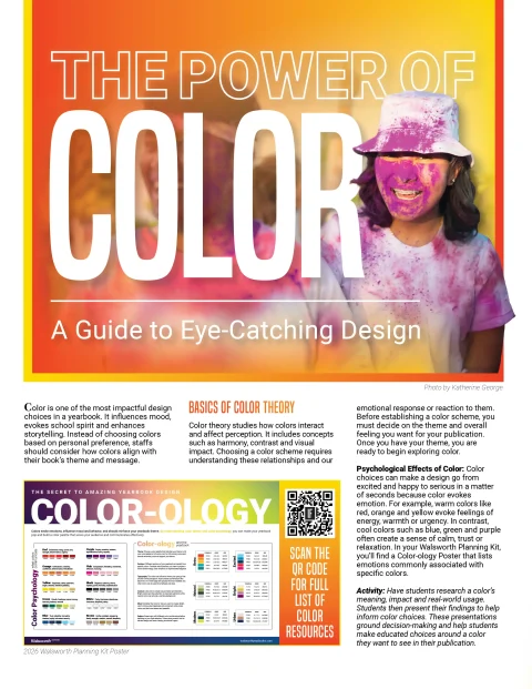

Color is one of the most impactful design choices in a yearbook. It influences mood, evokes school spirit and enhances storytelling. Instead of choosing colors based on personal preference, staffs should consider how colors align with their book’s theme and message. Basics of Color Theory Color theory studies how colors interact and affect perception. It includes concepts such as harmony,

In the latest episode of That Yearbook Podcast, hosts Sabrina Schmitz, CJE, and Jim Jordan kick off the school year with a lively conversation rooted in two things: excitement for what’s ahead and reflection on what we just saw from thousands of 2025 yearbooks. This fast-paced, insight-packed episode is a must-listen for advisers and students ready to up their game.