Basic design knowledge is necessary to creating a strong yearbook. Teaching students how and why design is important is a worthwhile exercise. It may seem to take forever, but once students grasp the basics, they will soon be able to use those skills to create a sophisticated spread.
You can start here with my Top 10 Design Rules for teaching basic design to students.
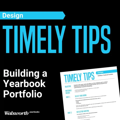
- Teach students the basics using the “Understanding Why Design Matters” unit of Walsworth’s Yearbook Suite. Order the workbook versions at walsworthyearbooks.com/yearbooksuite.
- Work on paper first. Students will grasp the columns and spread format quicker when doing all practices on paper.
- Always, always use columns and grids. My suggestion is to use as many columns as possible. Remember the rule of never starting or stopping in the middle of a column? Well, when you give a student lots of columns, they won’t try to stop in the middle.
- Incorporate an eyeline into all of your spreads. An eyeline unifies the left and right pages, allowing for creation of the spread as one document.
- Design from the inside out. Yes, we still want photos centered in the middle of the spread. Then we work with copy and finally negative space.
- Create internal margin consistency. This used to be fairly easy as it was always a one-pica separation of all elements. Nowadays, schools are reducing that space to sometimes nine or even six points. For basic design, always use a pica.
- Incorporate a dominant photo, copy area and headline into each spread as the first or most important focal point.
- Use strong photos with various forms of composition, such as single person, couples and small or large groups in addition to long shots, close ups and a variety of angles.
- Make sure every photo has a caption. If you can only give the reader the name and grade of a person, it’s better than no info at all. Sometimes you may use just the name and grade of a person up to three people. You may also use the name of a group: trumpet section or JV cheerleaders. Go to walsworthyearbooks.com/yearbooksuite and get the “Completing Your Copy with Captions and Headlines” unit of the Yearbook Suite.
- Use graphics and colors sparingly. You are designing for readability, not decorating a cake. Think about those lines around things; do you really need them? Can a block of color be lightened to allow for some interest or contrast? Can the use of a rail work to isolate an element?
- I know I said 10, but I have 11. The final rule is to work on the design, check it for readability, and finesse the spread until you have exactly the look and feel you are going for.
Applying these Top 10 (or 11) Design Rules will get your designers telling a great story rather than just placing pictures on a spread.