For this issue of Idea File, I have collaborated with my good friend Becky Tate from Shawnee Mission North High School in Overland Park, Kansas. We decided there are two areas of design that everyone should pay attention to – deciding on and using fonts correctly, and creating pages/spreads that will visually help tell the story.
Young designers are frequently set loose on computers and programs without understanding the basics. Then, they sit, stare at the screens or their phone text messages and try to disappear from the sight of the editor or advisers. Let’s address both scenarios.
First of all, you still need to thoroughly teach the basics of page design. Use the Walsworth Basic Design 2019 PowerPoint (walsworthyearbooks.com/2019design), some magazines and a few good yearbooks. Spend ample time going through the basics. Students will need to know about columns, eyeline, dominance and negative space among other terms.
But before your designers get a chance to design pages, decisions need to be made by the editor-in-chief with assistance from the design editor and some oversight from the adviser. The following items need to be decided to help drive the look: font choice, size and placement. You will want to create a visual style guide for your staff. This should be done in addition to creating libraries in InDesign with these components. Save it in your Google Drive and post it around the room — that way, when someone says, “Is this the right font?” he can check for himself.
Font
Font choice is important. Unfortunately, however, most staffs pick fonts last, often choosing large fonts to fill space that has been left for body copy. Also, something that dates yearbook spreads to times of old is justified text.
Simply put, great design, writing and photography can be destroyed with poor font selection.
- Font choice is key
Choose a font family, test drive it and see if it fits your publication’s personality. The age-old philosophy of Serif fonts (Times Roman) for copy and captions is no longer necessary. Today, designers can find fonts that will also help with the personality of the book. I personally like fonts from the Futura or Myriad families. There are many font families that will work with your publication style.
Be forewarned, when you are deciding on your fonts, you should print the pages at 100 percent (the actual size of your book) because, when you print 12-point body copy on a page that has been “shrunk” to 71 percent, the type looks much smaller than it really will when printed at 100 percent.
- Size is important
Stop using a large font size for your caption and body copy. Twelve-point font size, no matter the family, is too big. A good rule of thumb is no larger than 10 point for caption and body fonts. If you decide to use the sans serif variety of Myriad Pro for instance, that font looks a bit larger; so anything around 8 point or 9 point is very doable. This smaller font size will lend some sophistication to your publication.
- Keep it natural
Justified copy on both sides creates weird white space called “rivers” inside the text block. And copy that is justified on both sides is difficult to read. Ragged-right copy is always best. Yes, that includes captions on left-handed pages.
Now it’s time to design. Let’s get right to those computers… or do we?
Design
Remember, you are really teaching two completely different concepts here: design and technology. For the most part, students who are new to design are also new to the design tools within their computer programs. So, not only do they need training on page/spread design, they need to master those tools. In other words, this process may take a bit of time. Do not rush.
- Use inspiration
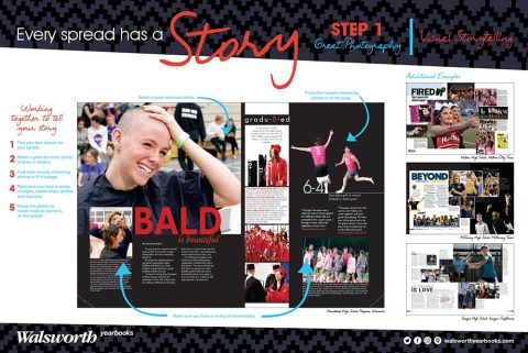
Sitting a new kid in front of a blank screen and having them draw a layout is nuts. Instead, have the student find a magazine, study its design and then sketch a desired concept. This can be completed on a blank piece of notebook paper prior to going to the design program. Then, have them look at their design and decide where a few more or a few less photos could help. And FINALLY (really emphasize the finally here), allow the designer to add headline design and/or graphics to help tell the story. Adding graphics first is the wrong way to do this. PERIOD.
- Once the design seems to be finalized, have the student go back and check for the required basics:
-
-
- Is the design fitting within the required columnar structure?
- Is there dominance?
- Is copy in a readable area of the spread?
- Is there linkage of the pages, usually with some sort of eyeline or the dominant element crossing the gutter?
- Are all photos facing toward the action or center of the spread?
- Do the dominant photo, headline, subheadline and story tie together?
- Does the copy have some sort of connection, usually complete with words?
- Does every photo have a caption?
- Is negative space used to help tell the story?
- Is there at least one “alternative copy/mod” block on the page?
-
Now, this design process will take most students a while to master. Do not rush practicing it. Just like you did when testing your fonts, print the final page/spread at 100 percent and project it up on a screen so the entire class can weigh in on the look and feel. Do this with each student’s work. Everyone will learn from these critiques.
Tell a story
Finally, designing to tell the story is an ongoing process. This process takes time and requires an open mind and broad shoulders. The points I’ve made here are just the beginning. With practice and strong inspiration, photos and copy, designers will be able to create visually appealing stories for your 2019 yearbook.