Color is one of the most impactful design choices in a yearbook. It influences mood, evokes school spirit and enhances storytelling. Instead of choosing colors based on personal preference, staffs should consider how colors align with their book’s theme and message.
Basics of Color Theory
Color theory studies how colors interact and affect perception. It includes concepts such as harmony, contrast and visual impact. Choosing a color scheme requires understanding these relationships and our emotional response or reaction to them. Before establishing a color scheme, you must decide on the theme and overall feeling you want for your publication. Once you have your theme, you are ready to begin exploring color.
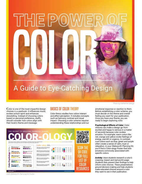
Psychological Effects of Color: Color choices can make a design go from excited and happy to serious in a matter of seconds because color evokes emotion. For example, warm colors like red, orange and yellow evoke feelings of energy, warmth or urgency. In contrast, cool colors such as blue, green and purple often create a sense of calm, trust or relaxation. In your Walsworth Planning Kit, you’ll find a Color-ology Poster that lists emotions commonly associated with specific colors.
Activity: Have students research a color’s meaning, impact and real-world usage. Students then present their findings to help inform color choices. These presentations ground decision-making and help students make educated choices around a color they want to see in their publication.
Creating a Color Scheme
Start with a primary color that matches the book’s mood, then build a supporting palette using the color wheel. The wheel showcases primary, secondary and tertiary colors, ordered in a way that helps you understand how colors work together.
Complementary colors sit across from each other on the wheel. These are often our sports teams or holiday colors. Red and green or purple and yellow are examples of complementary colors. Complementary color schemes tend to be high-contrast and make striking designs. Analogous colors sit next to each other on the color wheel, like blue, blue-green and green. This tight-knit color harmony creates a cohesive design that feels more unified. These two examples are simplified harmonies – there are thousands of ways to combine different colors in various harmonies to create a specific feeling.
Often, color schemes combine cool and warm colors in a design. You and your editors must monitor the work during this stage to ensure the mood doesn’t shift. Look at the color combination examples in the Formula Color Booklet found in the Walsworth Planning Kit. The cover design shifts through various color sets to establish a different mood even though the design never changes. Color communicates at a top level to your reader. It is often more impactful than the design itself in providing a message.
Multiple online resources can help you explore harmonies and receive color suggestions so you are not starting from scratch. Scan the QR code for a full list of resources.
Activity: Go back to your theme copy or idea. Have students develop a word web of emotions and traits that connect with your theme. Then, apply different color schemes to your cover and discuss how each changes the book’s mood. Identify which scheme best aligns with the desired theme.
Color Perception
Color perception focuses on the ability to distinguish and interpret different colors based on the wavelengths of light. Light, screen vs. print differences and individual vision all influence a person’s perception of color.
Light and Environment: Lighting affects how colors appear. A dark room, fluorescent lights, natural light, full sun – all these things impact color readability and shift what you see. Review your designs in the spaces where the book will be initially released and viewed.
Screen vs. Print: Although we develop designs on a screen, which operates by projecting light, a yearbook is a final printed product that absorbs and reflects light quite differently than a screen. Digital screens use RGB (Red, Green, Blue), making colors appear brighter. Print uses CMYK (Cyan, Magenta, Yellow, Black), often resulting in darker colors.
Beyond physical light, it is easy to see that screen design vs. print design mixes different colors to create what you are viewing. Thus, there is always a shift from what you see on screen to what you print. Always print proofs to check accuracy before finalizing designs.
You can also ask your Walsworth representative or customer service to send you printed proofs
to better represent the final product. Another tool that can help you avoid significant color shifts is a publisher’s color chart (in your Formula Color Booklet found in the Walsworth Planning Kit). Find colors on the chart that match what you want your book to look like, then employ those CMYK colors in your designs. This ensures the final print matches your expectations.
Vision and Accessibility: Contrast issues and color perception can affect readability. A viewer may perceive similar colors printed together as one color. For example, if you pick a similar blue and green, a viewer may not be able to distinguish between the two. This does not mean that you cannot have the two colors operating in your color scheme, but you might develop a rule that they are never allowed to operate on the same spread together. It is important to note that red-green color blindness is common, so avoid these colors together even though they may appear very different to you.
Body copy and captions should always use dark colors; if not black, opt for dark gray, navy or dark green. There has been an increase in reverse copy appearing within books (light type on a dark background). Take caution with reverse copy – reading it is much harder for your brain. To address this, you need your fonts to operate slightly larger in reverse copy and should consider tracking out the words beyond the default. (Tracking refers to the space between each letter. To accommodate ink flow and saturation, increase the tracking slightly.)
Always check your color combinations using an ADA Color Checker.
Applying Color Effectively
Yearbooks contain photos with inherent color variation. Overusing additional colors can overwhelm a design. Color should enhance focus, rather than just serve as an interesting add-on. Before working with color, develop a well-balanced B&W spread or mod that carries the proper hierarchy in size and space, then add color to enhance the message.
Follow these guidelines:
- Limit “extra” colors to two to three per spread for consistency.
- Use drop color (colors pulled from photos) for natural integration.
- Contrast is key – ensure headlines, captions and body text are legible.
- Color should enhance focus or help divide information, not be applied randomly.
- Intentional use of white space will provide visual relief between sections of information.
- Be cautious with reverse copy (light text on a dark background) as it can be hard to read.
Establishing a Color Guide
A consistent color strategy ensures cohesion across the book. After experimenting with your color scheme, you should develop rules that your layouts can follow to support your staff in designing.
Consider these questions:
- How are headlines colored?
- How are sidebars/mods operating with color?
- Are page numbers colored, and are those colors changing with the spread color?
- Are you using drop color, and how is that operating?
- Is any part of a caption colored? Is that color choice dependent on other things on the spread?
- Are there potential readability issues (avoiding yellow text, for example)?
- Are there certain color combinations you want to avoid?
Activity: Have students apply different color treatments to spreads, print them and analyze their effectiveness. As students identify success and pain points, editors can develop rules the team must to follow. They can then develop a color guide based on their findings.
Conclusion
Color is a powerful storytelling tool in design. Understanding its psychological impact, harmonizing colors effectively and considering perception factors will ensure a visually compelling theme and cohesive book. Use structured activities and guidelines to make informed, intentional color choices that elevate your final product.