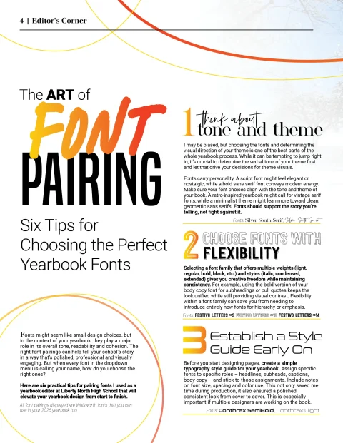
Fonts might seem like small design choices, but in the context of your yearbook, they play a major role in its overall tone, readability and cohesion. The right font pairings can help tell your school’s story in a way that’s polished, professional and visually engaging. But when every font in the dropdown menu is calling your name, how do you choose the right ones?
Here are six practical tips for pairing fonts I used as a yearbook editor at Liberty North High School that will elevate your yearbook design from start to finish.
-
THINK ABOUT TONE AND THEME
I may be biased, but choosing the fonts and determining the visual direction of your theme is one of the best parts of the whole yearbook process. While it can be tempting to jump right in, it’s crucial to determine the verbal tone of your theme first and let that drive your decisions for theme visuals.
Fonts carry personality. A script font might feel elegant or nostalgic, while a bold sans serif font conveys modern energy. Make sure your font choices align with the tone and theme of your book. A retro-inspired yearbook might call for vintage serif fonts, while a minimalist theme might lean more toward clean, geometric sans serifs. Fonts should support the story you’re telling, not fight against it.
-
CHOOSE FONTS WITH FLEXIBILITY
Selecting a font family that offers multiple weights (light, regular, bold, black, etc.) and styles (italic, condensed, extended) gives you creative freedom while maintaining consistency. For example, using the bold version of your body copy font for subheadings or pull quotes keeps the look unified while still providing visual contrast. Flexibility within a font family can save you from needing to introduce entirely new fonts for hierarchy or emphasis.
-
ESTABLISH A STYLE GUIDE EARLY ON
Before you start designing pages, create a simple typography style guide for your yearbook. Assign specific fonts to specific roles – headlines, subheads, captions, body copy – and stick to those assignments. Include notes on font size, spacing and color use. This not only saved me time during production, it also ensured a polished, consistent look from cover to cover. This is especially important if multiple designers are working on the book.
-
KEEP IT SIMPLE
When it comes to fonts, less is definitely more. Sticking to two or three font families throughout your yearbook helps maintain a cohesive look and prevents pages from feeling cluttered or chaotic. Too many fonts can distract from the amazing stories and memories you’ve worked so hard to collect.
-
CONTRAST IS KEY (BUT DON’T OVERDO IT)
Good font pairings create visual contrast without clashing. Try pairing a serif with a sans serif, or a decorative headline font with a clean, readable body font. The goal is to make each type of text easy to distinguish while maintaining harmony across the page. Avoid pairing two fonts that are too similar – it can look like a mistake rather than an intentional design choice.
-
ALWAYS PRIORITIZE READABILITY
No matter how beautiful or trendy a font may be, it’s not the right choice if it’s hard to read. Especially for body copy and captions, choose fonts with clear letterforms, ample spacing and strong legibility at smaller sizes. Your yearbook is meant to be read and revisited for years to come – make sure everyone from students to grandparents can enjoy it without squinting.
FINAL THOUGHTS
Pairing fonts isn’t just a design decision – it’s a storytelling tool. By being intentional with your choices, setting clear guidelines and prioritizing consistency and clarity, you’ll set the tone for a yearbook that looks as professional as it is personal. So choose wisely, trust your instincts and remember: when it comes to typography, a little planning goes a long way.