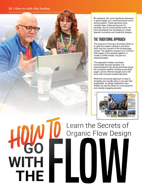
In yearbook, the most significant elements in great design are a dominant photo and a strong eyeline. These elements have created clean, balanced layouts for decades. But as visual trends evolve, we have developed new strategies to create layered, innovative and impactful designs.
The Traditional Approach
The purpose of having a dominant photo is to grab the reader’s attention and draw them into the content of the double-page spread. The eyeline’s purpose is to connect both pages of the spread together to create a unified whole, not just two separate pages.
This approach creates very linear, horizontally focused spreads. It is characterized by the strong dominant photo, the consistent eyeline running across both pages, narrow internal margins and a full story with minimal modular elements.
While this structured approach is easy to template and visually clean, it can also feel predictable. As design aesthetics have shifted, so has the desire for more dynamic and visually engaging spreads.
Overlapping
One of the first steps in this evolution is to interrupt the traditional eyeline. Rather than a solid rail of white space from one side to the other, many designers break the eyeline with a photo that overlaps the dominant image. This overlap adds depth and energy, creating a sense of layering to draw the eye in a circular direction around the page.
This is just one way we see layering used in contemporary yearbooks. Headline treatments and cutouts also help create eye-catching visuals.
Creating Photo Clusters
Next, multiple photos started overlapping the dominant, turning into photo clusters. This layering effect creates a more compelling layout that leads the reader’s eye around the content on the spread more naturally.
For example, a well-designed cluster might begin in the upper left corner and gently flow toward the bottom right of the spread. This type of visual movement replaces the rigid structure of a single eyeline with something more intuitive and story-driven.
One reason photo clusters have gained popularity in recent years is due to the rise of modular storytelling. Many schools lean into quotes, Q&As and other packaged, easy-to-read coverage for both dominant and supplemental content. Incorporating mods into these emerging organic spreads creates balance and a natural flow.
Using Mini Eyelines
Rather than a full eyeline extending across both pages of the spread, another option is to incorporate two mini eyelines. In the spread to the right, one eyeline is positioned in the white space below the dominant photo and the other below the copy block on the right side of the layout. This strategy can be tricky to get right, but when done well, the new, mini eyelines will more effectively guide the reader’s eye around the page to additional content.
Fibonacci & Golden Spiral
Why is this organic look so pleasing and familiar? We find this type of organic design in nature, and it is naturally pleasing to the eye. Your eye moves from the dominant element naturally around the spread.
A connection can be made to the classical Fibonacci spiral, is a curve that approximates the golden spiral, created by drawing arcs connecting the opposite corners of squares.
In design, this spiral is valued because it naturally leads the eye along a pleasing, organic path – often associated with balance and harmony.
As you design your 2026 book, take the time to experiment with new approaches to design. The classic eyeline and dominant photo structure still work, and in some contexts, it may be exactly what you need. But exploring new layouts and trying a more organic approach can bring energy and movement to your spread, while still keeping everything connected.