
Moving your theme beyond the cover
Written by Becka Cremer
There is no such thing as a perfect theme, but any theme can become a great theme. The trick is to develop the theme thoroughly and commit to it.
But before you can commit to a theme, you must understand your school and your students. Allow the details of your school and of the year to drive your theme. Once you do that, then examine ways to express those details that make up your school. For example, choose a phrase your students identify with or use daily. You can then use the theme phrase to inspire content and design elements.
Your theme’s verbal and visual elements can influence every choice your staff makes. Headline, caption and body copy fonts; folio graphics; sidebar content and format; even the questions your reporters ask sources can all relate back to your theme concept. The more your staff refers back to its theme phrase and concept and thematic design elements, the stronger your theme will be.
When it is time for you to start working on the theme for your next yearbook, check out these spreads from four yearbooks across the country. Each staff chose a different theme and approached theme development in vastly different ways. What each of them has in common, however, is total commitment to the theme concept.
Le Fleuve 2010
Our Lady of Lourdes Academy
Miami, Fla.
Theme: “Spoken”
Adviser: Rebecca Retana
Editor: Alexandra Garrigo

Cover
“Words bring life to our memories,” the editor of the 2010 Le Fleuve writes in the colophon. This phrase alone captures the reason the staff chose the theme “Spoken” for its 2010 book. The staff developed the theme by focusing on quotes, complete stories and the people whose voices made up the school year.
A bold color choice and slab serif font set the mood for the design style of the book. Punctuation-mark graphics, especially quotation marks, further develop the theme visually. The 2010 Le Fleuve staff sets up an expectation of a modern, fun, fresh book with this cover.

Front endsheet
The traditional sections of a yearbook are given a thematic twist on the front endsheet. Each section has been given a spin-off title that is a section-specific synonym for “say.” For example, the title “cheer” has been given to the sports section and “whisper” to the academics section. These titles reflect the way students are expected to speak during the activities in each section.
The color palette of the book is furthered here. A bright lime green joins the blue from the cover. These colors appear throughout the book, furthering the design plan. The style of the graphic on the left side of the endsheet is also used throughout the book.

Pages 108-109
The staff took its theme development beyond visual elements. Stories throughout the book make excellent use of quotes, and every spread, like this one on AP government, includes a pull quote that adds more information in a thematic way. Stories with strong student quotes are a product of thorough interviewing. Consistent fonts, large graphic elements and photos that bleed off the page also send home the “Spoken” message visually.

Pages 174-175
The people section of the 2010 Le Fleuve furthers the theme “Spoken” with quote collections. Each quote collection centers on something common to the high school experience. Notice that the same colors and fonts used elsewhere are also here. Bold graphic elements, such as the paint splatters on these pages, are characteristic of the details on other spreads.
Lair 2010
Shawnee Mission Northwest High School
Shawnee, Kan.
Theme: “My shoes”
Adviser: Susan Massy
Editors: Annie Unruh, Lauren Minick

Cover
The 2010 Lair staff started with a desire to cover different perspectives. The end product of a few long discussions and a week at yearbook camp is the theme “My shoes.” The staff explains in the opening copy that the wear and tear on a high school student’s shoes let people know where they’ve been. “Every mark, every stain, every duct-taped hole tells a story.”
Instead of photos or graphics of actual shoes, the staff chose the prints shoes make as we travel through life as a graphic element throughout the book. The impressions left by shoes take the symbolism of the theme one step deeper. Subdued, highly saturated colors are introduced on the cover and used inside.

Pages 12-13
Much of the theme development uses shoes as a symbol, but the staff was sure to get some real shoes in the book, too. This soccer spread’s sidebar addresses the actual shoes worn by soccer players: cleats. Notice the way the shoe-print graphic has been used subtly on this spread behind the headline letters. By varying the way the shoe graphic is used, the staff carries the same graphic throughout the book without having it get old.
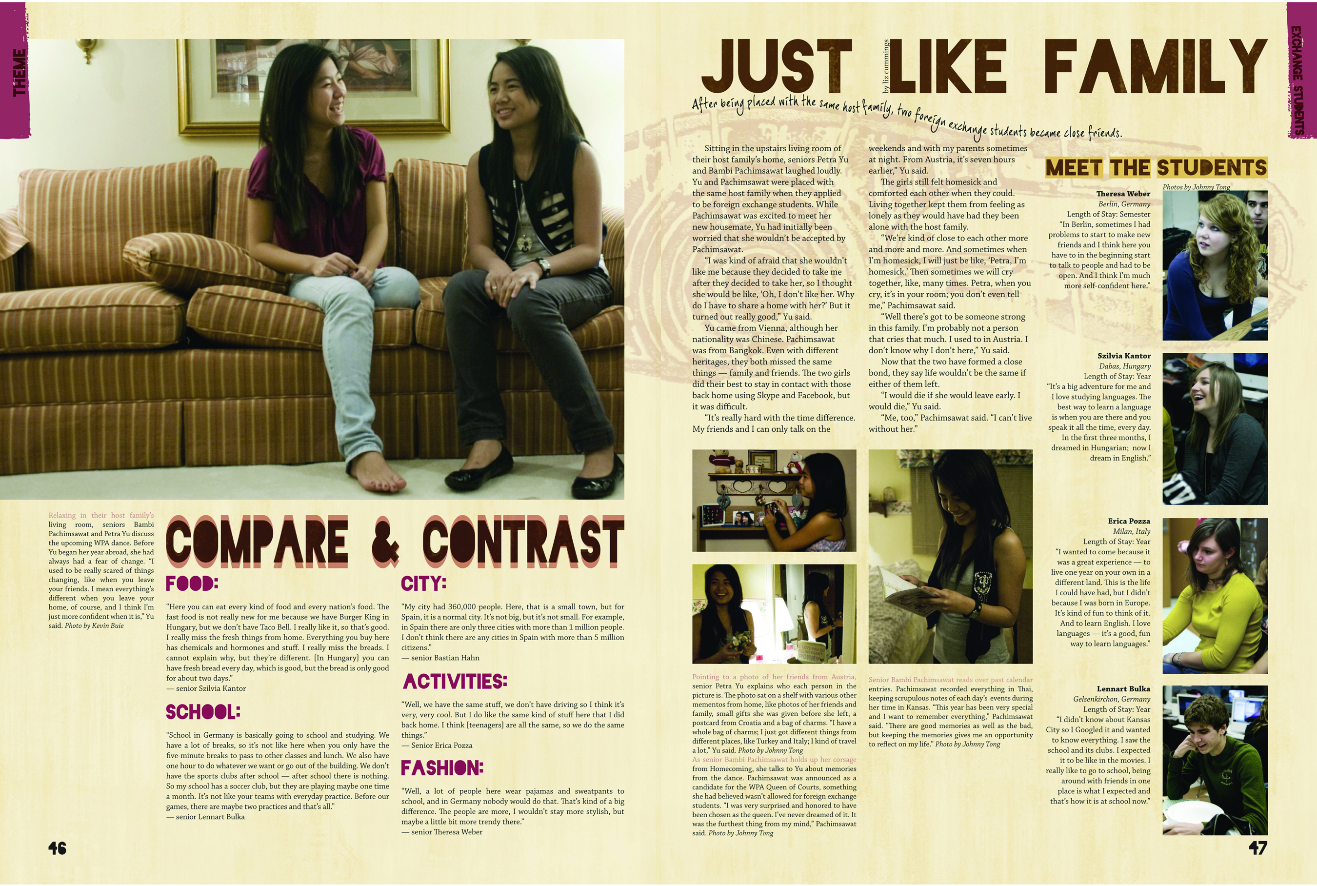
Pages 46-47
Theme stories are scattered throughout the book. These stories focus on students who have unique perspectives of the school. This spread asks readers to take a walk in the shoes of two foreign exchange students who became friends while staying with the same host family. The girls share their stories in the main copy block and one sidebar; the other sidebar introduces the reader to other foreign exchange students at the school during the year.
Pages 118-119
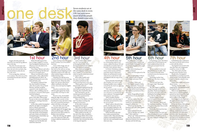
The best themes allow editors and writers to choose story angles that best capture the year and further the theme concept. On this spread, this profile focuses on a location shared by seven students during the school day: the desk second from the left at the front of room 130. The writer observed all of the students who used that desk throughout the day. These students have the same perspective of room 130 — literally. This twist on the theme concept captures the lives of seven students in one profile spread, which serves both the theme and the ultimate yearbook goal of including every student in the yearbook.
Tradition 2010
John Paul Stevens High School
San Antonio, Texas
Theme: whatayear
Adviser: Christine Keyser-Fanick
Editor: Joyce Isleta
Cover
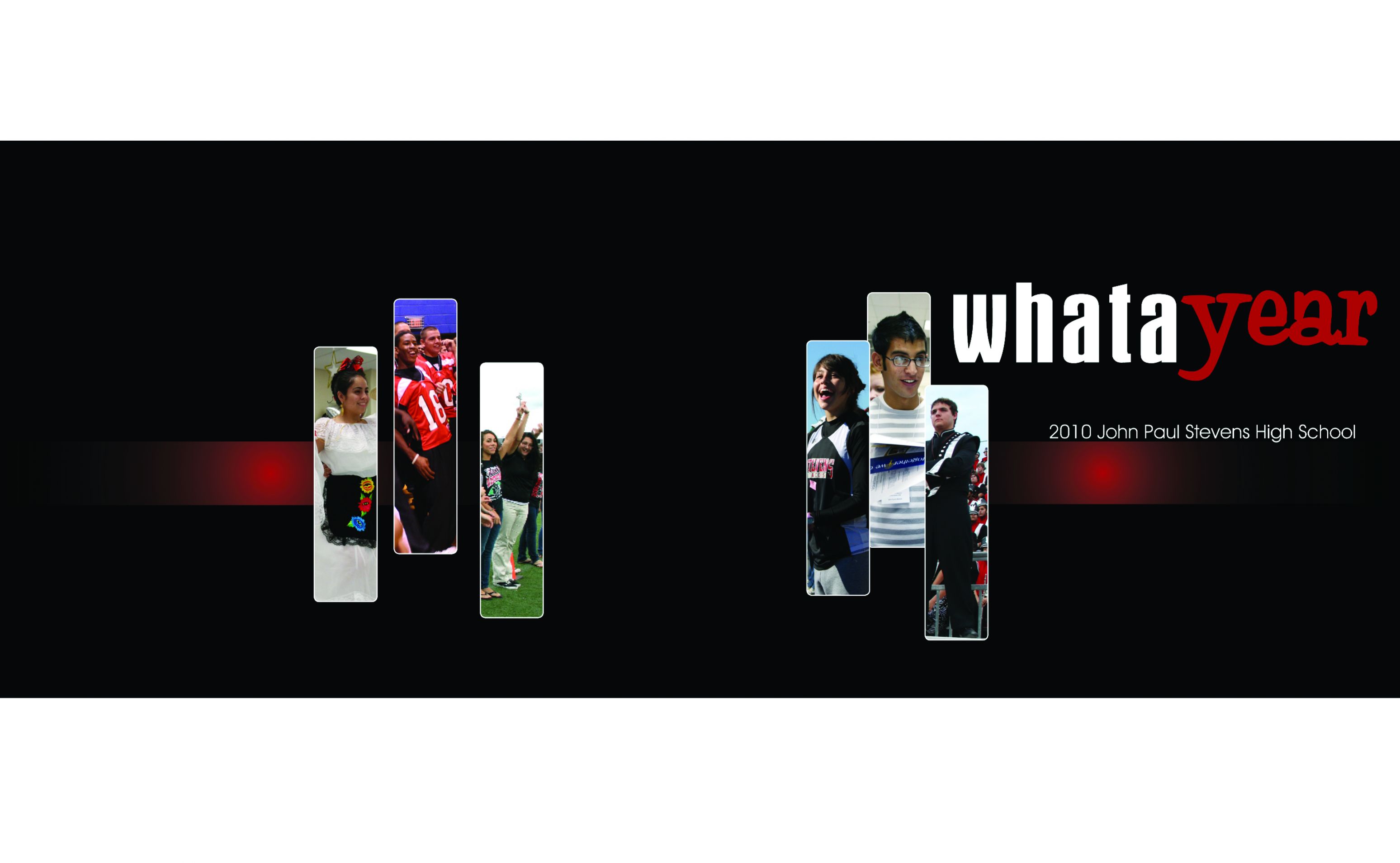
The theme of the 2010 Tradition, “whatayear,” echoes the way today’s high school students talk and sets the stage for a book that focuses on the positive aspects of John Paul Stevens High School. As the opening copy puts it, “WhataYear. An amazing year. A year like no other.” Concrete details about the events of the year support those statements.
A great cover is just the introduction of a great theme and the 2010 Tradition makes a great impression. Strong vertical photos with rounded corners, a horizontal stripe with a circular gradient and the colors red, white and black from this cover are all carried throughout the book.

Pages 6-7
Divider pages make use of the theme logo design to present the section spin-off titles. The font choices alone clearly connect this spread to the rest of the theme pages in this book. The rest of the design plan clearly pulls the Tradition’s design plan onto this spread. Tall, vertical photos with rounded corners introduced on the cover also appear on the dividers. The divider copy here further develops the theme with real-life examples from the lives of students at John Paul Stevens High School in 2010. These details celebrate the best things in students’ lives.
Pages 34-35
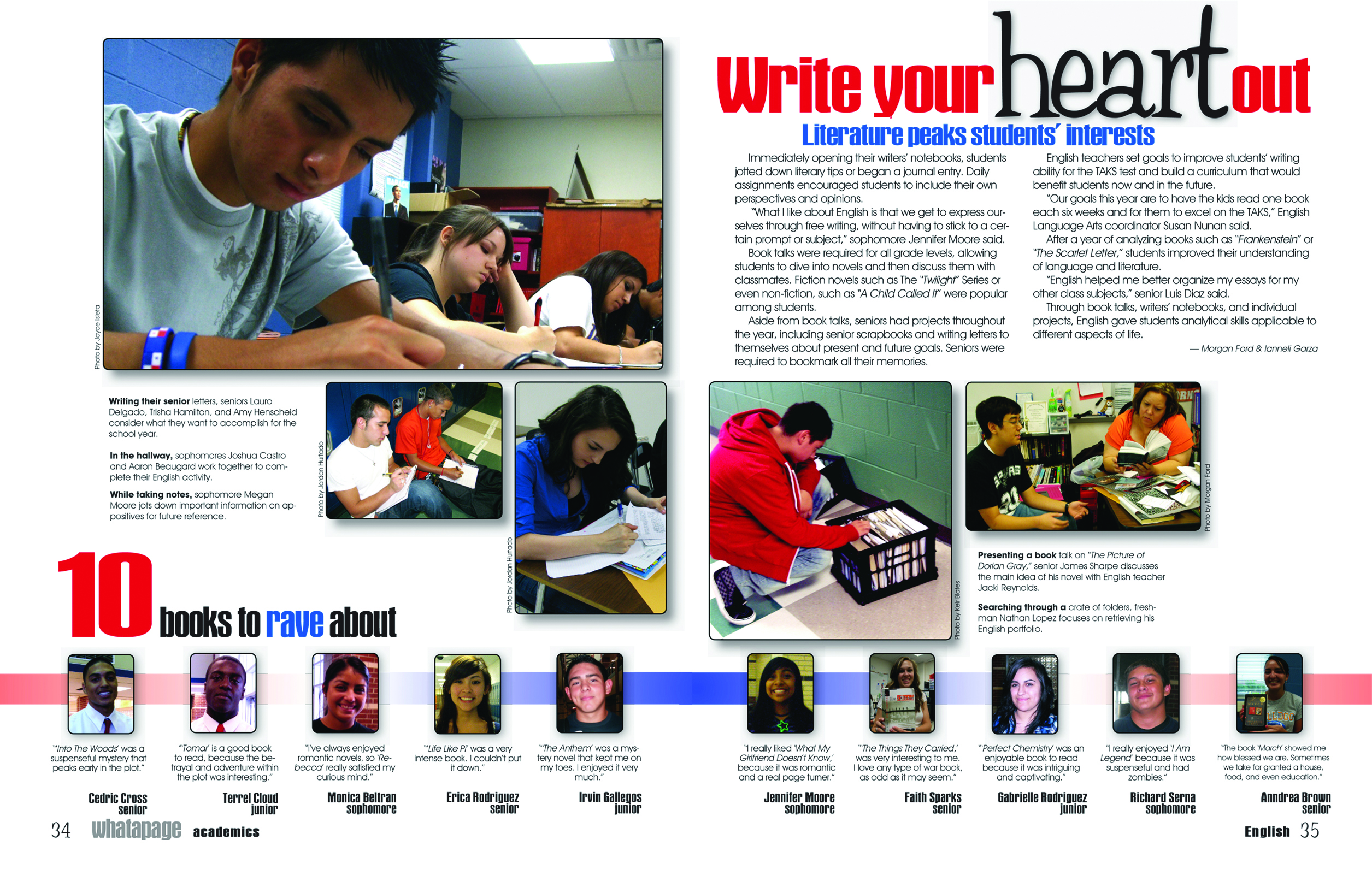
The theme “whatayear” moves from divider pages onto story pages. This spread, about English classes, uses the same fonts, colors and graphics seen on other pages. It also incorporates a sidebar that includes 10 quotes from students. On this page, the quotes are about books the students enjoyed. These “10 things” sidebars continue throughout the academics section, connecting the topics of stories to the 10 in 2010.
The content spreads follow a traditional design plan, with use of columns and clear eyelines. Graphic details, such as rounded corners and drop shadows on photos, help make these otherwise traditional designs interesting and theme-related.
Accolade 2009
Episcopal High School
Baton Rouge, La.
Theme: Now You Know
Adviser: Carrie Goodall
Editors: Brooke Noland, Emma Rollo
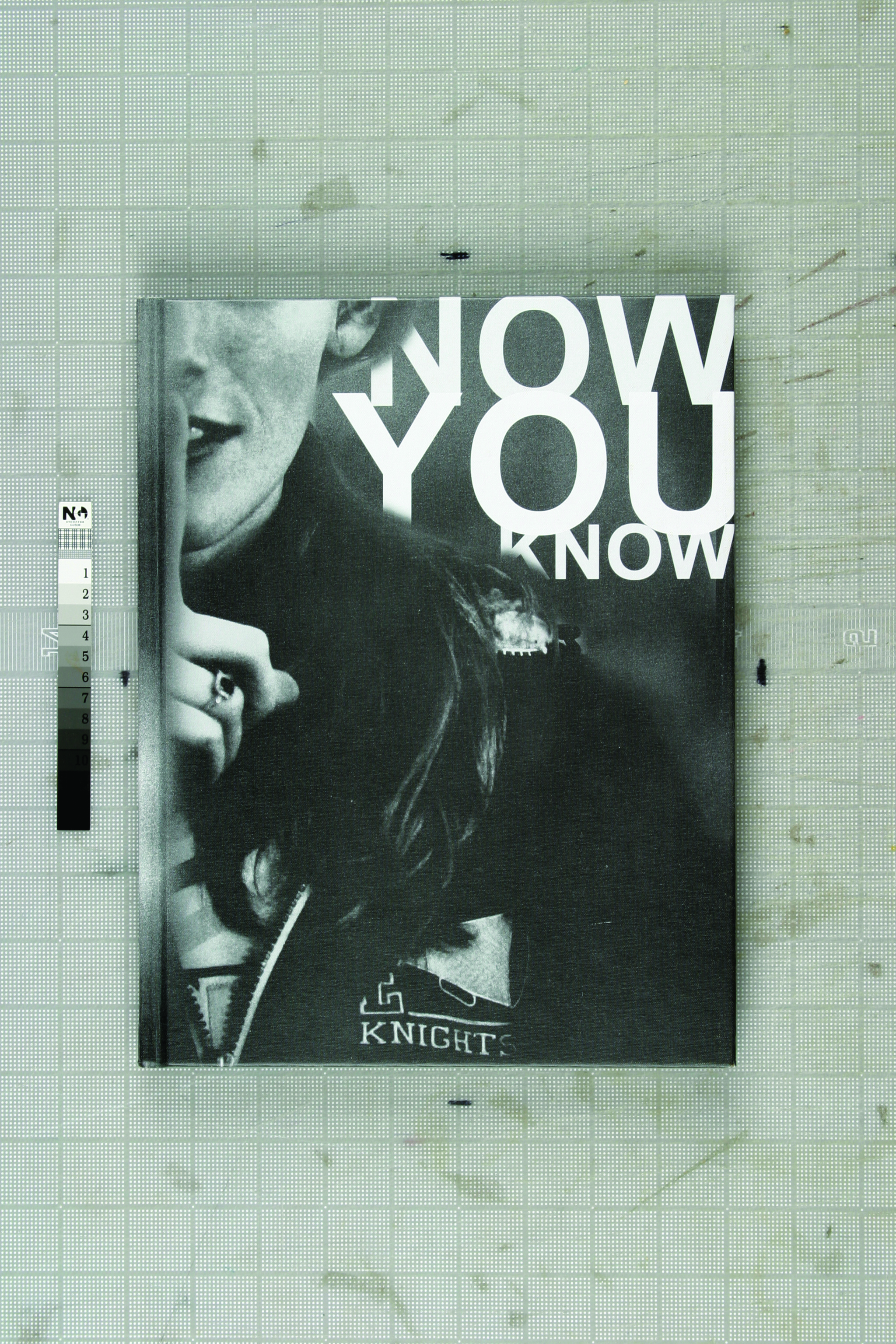
Cover
The Accolade staff wanted to celebrate Episcopal High School’s 40th anniversary while capturing the mood, stories and style of 2009. To do this, the staff chose the theme “Now You Know” and focused on the facts that define Episcopal High School — as it is today and what it has been over the past 40 years. The cover features a student in a school letter jacket and a clean, sans serif font. These two elements introduce readers to the conceptual theme of school spirit as well as the design theme they will find inside. On the back cover, a cluster of facts about the 2009 school year ties this school spirit theme to the year.

Pages 6-7
The Accolade is divided into five main sections: Events, Life, Sports, Reference and Memories. The first spread of each section is dedicated to anniversary coverage. This approach pays adequate attention to the milestone the school has reached without allowing the history of the school to overshadow the current year.
This spread, the first in the Events section, commemorates the day the school was hit by a tornado in 1971. The story is told in the same way all of the anniversary stories are told — in the words of former Episcopal students and teachers. A cluster of defining facts runs along the left edge. These fact collections appear on every content spread and carry the theme throughout the book.
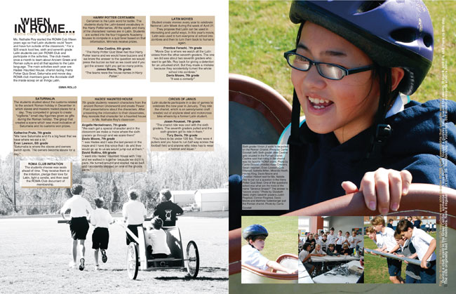
Pages 32-33
Most of the stories in the 2009 Accolade are told in a traditional format. However, this spread takes a more theme-centric approach. The writer of this story about ROMA Club (a Latin club that celebrates Greek and Roman history) details the club’s beginning and breaks down the club’s main events. Quotes and facts about the events educate students who may be unfamiliar with ROMA Club while capturing the memories created in 2009. This spread leaves readers feeling like they know what ROMA Club is all about.
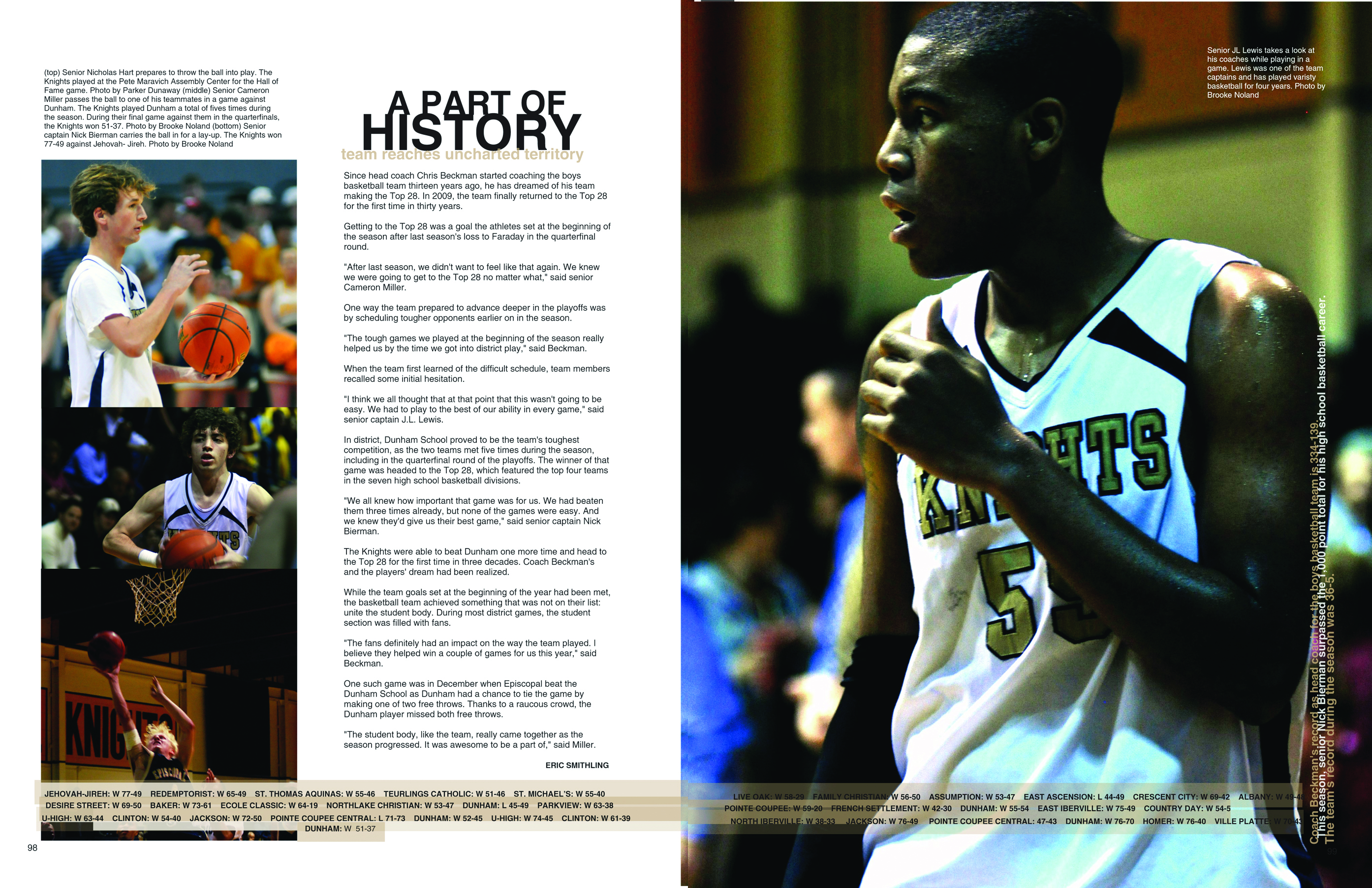
Pages 98-99
This basketball spread fits seamlessly into the book. It covers a major accomplishment in the basketball team’s history: the first time the team was in the Top 28 in 30 years. The story covers important moments of the season, and facts that add to the story run up the right side of the spread. Every sports spread also features a detailed scoreboard.
Notice the use of a clear color palette and consistent fonts. By limiting the colors and fonts, the designers pull the spreads of the book together and carry the visual theme from cover to cover.
3 Responses to “Moving your theme beyond the cover”
Comments are closed.


November 23, 2011 at 2:22 am, Cassie said:
Hi I’m editor for my high school’s yearbook this year and we picked the theme storybook/scrapbook. Its not as concrete as I would like it to be but it’s been decided. I’m having a very hard time trying to tie the theme in throughout the book. We like the idea of the book being “Our story” and we like a warm and personal feeling scrapbooks give off. If you have any ideas how to help us flow our theme throughout the book I’d appreciate it!
September 30, 2013 at 12:47 pm, Yearbook assignment for today — APAblog.org said:
[…] http://www.walsworthyearbooks.com/idea-file/51110/moving-your-theme-beyond-the-cover/ […]