Oswego High cover design symbolizes connections
Written by Jamie Chambers
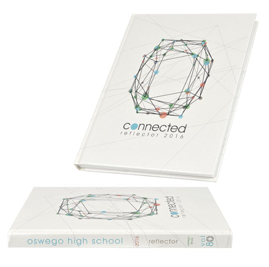
This week’s Cover Spotlight comes from the 2016 Reflector of Oswego High School in Oswego, Illinois.
The Oswego staff used an abstract design to symbolize the various connections or links students have within their school. A simple sans serif font was used for the theme “connected,” which works well with the fine lines of the abstract design.
When creating the inside of their book, the staff not only utilized the multidirectional lines, but they used each of the five colors to represent a section of their book.
The base material of the cover is a Luminaire Metallic White linen, which gives the colors printed on the cover a slight shimmer. If you look closely at the volume number 80 on the spine of the book, you can see same fun, abstract design used as the “0.”
You can see more great cover designs by looking at previous Cover Spotlights or by scrolling through our Cover Gallery.
Comments are closed.

