Level Up your yearbook design
Written by Jenica Hallman, CJE
They say beauty is in the eye of the beholder. As yearbookers, we know the pride you see when you hold that finished product, but are you effectively conveying your message to the intended beholder – the student body – through your design?
Since a little design TLC never hurt anyone, we’ve compiled some of the best resources to Level Up your yearbook design. But let’s talk why first and discuss why design matters.
But first, why?
Design really comes down to identity and effective communication.
“Design provides a visual identity to a written message that you are trying to communicate,” Walsworth senior graphic designer Sarah Roberts said. “Think about the countless book covers, websites, billboards and ads you are inundated with every day. Now, imagine all those mediums written in Times New Roman, left justified, like a word document. How boring and ineffective? Your message gets lost among the crowd. That is why design is so important.”
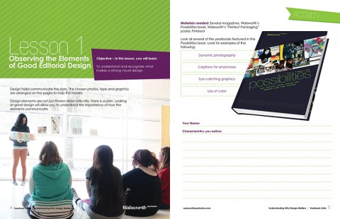
Walsworth’s curriculum unit, “Understanding Why Design Matters,” is one of the resources that will help you start to Level Up your design.
On the other side of no design is getting overly focused on one aspect of design. In our Yearbook Suite curriculum book, “Understanding Why Design Matters,” author Mike Taylor, CJE, explains, “Publication design is more than placing pictures on pages. It’s more than picking pretty fonts. It’s more than using green, ‘because it’s my favorite color.’ Good designers evolve and good design communicates. It draws the reader in, it enhances stories, it drives your well-chosen theme.”
All those things are certainly important, but design is so much more. When you understand why, the how becomes easier.
It’s important to note that the concept of Level Up is relative to where you start. If your design is currently more of a scrapbook collage, then it’s best to start with some basic design principles and set realistic goals. Perhaps focus on following an eyeline, choosing a dominant photo and sticking to a defined color and font palette. If you perform well at state competitions, but want to perform at national competitions, we have advanced design technique help too.
Where do I start?
Glad you asked! One of the easiest and perhaps most enjoyable ways to start is to browse great design. When you start to recognize great design, that inspiration will translate to your own pages.
Design can and should be found anywhere and everywhere, and it’s often overlooked. Store shopping bags, catalogs, college brochures, websites, logos, magazines and it should go without saying, other yearbooks! Talk to your yearbook rep about samples they can bring you and your staff to peruse, take a trip to Barnes & Noble and go to Walsworth’s Design Showcase Gallery.
Some schools find it helpful to start with our showcase gallery, and then come back after they listened to webinars and podcasts and read eBooks and our curriculum, because they recognize the design elements better the second time. Decide if you want to go back, but definitely start here. This year’s Theme Gallery is our largest to date with examples of how theme translated into the design of the yearbook and our Cover Gallery is filled with yearbooks you’ll judge by their cover in the best way.
After you’ve done that, our Yearbook Suite curriculum has great workbooks like the previously mentioned “Understanding Why Design Matters” unit that will give you practical exercises to bulk up your design muscles and a thorough understanding of the terminology and process of design.
Anything else?
Of course! We have awesome webinars and eBooks packed with the pearls of wisdom from the top yearbook pros in the industry. Listen or watch the Content-driven Yearbook Design and Not Your Mama’s Yearbook webinars. Our Selecting Your Color Palette eBook will help you understand color choices, how to pair them and how they tie into theme.
Read about senior ad design, your design quest for inspiration and top 10 design rules for teaching design on our blog along with all the other great articles. Browse the Caught Our Eye column of Idea File magazine for examples of spreads that caught the eye of a seasoned yearbook adviser. Our kits even have a great “how to build a spread” poster that dissects a spread to help you understand it better.
One of the best ways to Level Up your design though is to attend summer workshops, Adviser Academy and an Elite Weekend. If you didn’t make it this year, talk to your staff and school administration about attending one (or all) next year. Our schools come out with detailed plans for their yearbook design after consulting with yearbook experts. In fact, 85% of our national award-winning schools attended an Elite Weekend – it’s that effective!
That sounds like a lot
It is. Your rep can help you pick the best resources for your specific needs, so talk to them to make the best use of your time. And we’re always working on new content, so check back with us often to see what’s new.
The bottom line is Walsworth has the resources you need to Level Up your design, no matter your current level. Keep striving and we know you will have a great year! Don’t forget to celebrate your achievements. After all, National Yearbook Week is all about celebrating yearbook and you!
Comments are closed.

