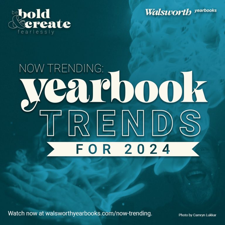
Now Trending: 2024 Yearbook Trends
Written by Shiloh Scott
Have you checked out our latest webinar? Now Trending: Yearbook Trends for 2024 breaks down 15 of the hottest trends in yearbook design. Hosts Mike Taylor, CJE, Jim Jordan and Sabrina Schmitz, CJE, covered typography and design trends in two sessions.
The first yearbook trends video specifically covers trends in typography. The second looks at more general yearbook trends. Be sure to watch both videos for in-depth discussion of 2024 yearbook trends with dozens of professional and yearbook examples.
Trends in Typography
“If there is anything easy to find out there right now in design trends, it is type,” Schmitz said. “And that tells you something, right? That tells you that this is a major tool that designers are relying on to create visual interest on their pages.”
1. Retro Fonts

2022 El Madrono, Palo Alto High School, Palo Alto, California
Retro fonts are having a moment. Many of the retro fonts that are hot right now have a mid-century or groovy 70s look. That doesn’t mean your book has to look like it’s from the past.
“Let your font do some of your design work for you. You can make it just by making something bigger, expanding it, making it smaller,” Jordan said. “Moving it around can really make a huge difference.”
Playing around with retro fonts and design can create a yearbook that works with your theme feels just right for the 2024 school year.
“Every one of these fonts that we’ve shown so far are large, big headlines,” Taylor said. “Everything is big about it. Don’t go making these things too small. Stay away from using this as a body copy, etc., because it’s not going to work.”
2. Interaction with Photo Content

2022 Marquee, Alexander W. Dreyfoos School of the Arts, West Palm Beach, Florida.
Jordan explained that, in the past, yearbooks strived for a pristine, beautiful photo. It’s still important to use good photos, but other rules have changed.
“Sometimes you want to mix it up by interacting your type with the photo, and some really fun and amazing things can result,” Jordan said.
Interacting type with photos can create depth and dimension on a yearbook spread.
“You just have to be cognizant of the fact that where you’re placing this text shouldn’t detract from the photo itself. It should actually drive your eye to the content in the photo,” Schmitz said.
3. Serif Type

2022 Ayrie, Liberty North High School, Liberty, Missouri
Serif is the French word for feet, and it refers to the parts that stick out at the ends of type. Taylor explained how versatile serif fonts can be.
“If you pick one of these as your or your headline type fonts, you may be able to go super small down to body copy, because that’s what Times New Roman was meant to be – 6 and 7 point,” he said.
Schmitz agreed that serif fonts can be played with to create all kinds of looks.
“You can make this work however you want it to, depending on what you do with it. Remember, it’s not just like ‘throw the text on the page in one text box and call it a day.’ So don’t be scared of taking a serif font on as your main headline, star-of-the-show font,” she said.
4. Type-driven Design

A spread from Bicycling magazine showcases type-driven design.
Type-driven design is design that takes a font and uses that font as the driving force behind the book’s design.
“The type is the star of the show,” Schmitz said.
5. Type Justification

Both flush-left, ragged right type and flush right, ragged left type are used in this spread from the 2023 Panther, H.B. Plant High School, Tampa, Florida.
There are a few different ways to justify type. The most common is flush-right, ragged left type. Sometimes you’ll see flush-left, ragged right, especially when used for a caption on a photo. If you choose to justify both sides, you have to do it carefully or you’ll get rivers in your text.
6. Leading

The 2022 Minuteman from Lexington High School in Lexington, Nebraska, uses increased leading to improve the legibility of white text on a black page.
Leading (pronounced leh-ding, not lee-ding) comes from an old print term. Printers would use lead bars to space out lines of text. Even though we don’t use lead bars anymore, the term stuck around.
“I’m always going to suggest people, on their theme copy, to over-lead it. Open it up a little bit,” Jordan said. “It makes it much more readable.”
Increasing or decreasing leading creates different effects. Jordan cautioned against using auto-leading in your design program. Instead, adjust to find what works for your yearbook.
7. One Font Family vs. Multiple Fonts

Two font families are used in the marching band spread of The Torch from Athens Drive Magnet High School in Raleigh, North Carolina.
Taylor is strong proponent of using one font family in your yearbook, but not everyone agrees. If you choose to use multiple font families, Taylor cautioned not to use more than three.
“What you do with that font is what’s going to make the difference,” Schmitz said. “So how you play with thick versions and thinner versions and different weights and italics. And how you’re interacting with the photo and color and size. All of that is what’s going to make the visual interest or not.”
Trends in Design
8. Using Color / Black and White

A GQ spread juxtaposes a vibrant photo of Usher in a pink suit next to a black-and-white image of the artist.
Mixing black-and-white images with pops of color is a tried-and-true design trick and can be found in 2024 yearbook trends.
“One of the things you want to look for are black and white photos that are definitely black and white. The blacks are solid black, they’re not milky gray. And the whites are white,” Taylor said, explaining the importance of contrast when using black and white photos.
9. Color Blocking

A fitness spread from Women’s Health uses color blocking in red.
Color blocking is frequently used in magazines and can be used in a multitude of ways.
“That’s kind of the fun part about it,” Schmitz said. “It can be used almost like a decorative piece. It can be used here to kind of chunk information and make little pockets of information – or mods in our case – stand out a little bit.”
10. Color Palette vs. Pulled Colors

A nutrition spread from Runner’s World uses the yellow from a picture of a banana for color blocking.
Should you use a color palette or pull colors from photographs? Should you do a combination of both? Do what works for your yearbook! It used to be that most staffs used a color palette. Now, it’s more common to see pulled colors in 2024 yearbook trends.
“You always want to pull a tertiary color like cream brown beige, something that goes with everything that would be that makes me happy,” Taylor said.
11. Color Type

A spread from Architectural Digest uses red type.
Bringing more color into type is a recent trend. We’ve seen color type in headlines, captions and pull quotes. However, Taylor cautioned that red or orange can be difficult to read in smaller font sizes.
”Any time you’re playing with typing color, always pay attention to that readability. That’s King. You’ve got to make sure people can actually read it. If it hurts peoples’ eyes to look at it, they’re going to move on real fast,” Schmitz said. “But it does draw your attention. We think people never read the copy. Sometimes putting things in a pop of color is what’s going to draw their eye to it.”
12. Spacing to Connect or Separate

A spread from Australian Traveler uses overlapping images and close spacing to connect elements on the page.
When you want to connect different parts on a spread, you’ll use less space between them. Overlapping photos, text or other elements can do that, too. If you want to separate elements of a spread, you put more space between them.
13. Spacing to Emphasize

A spread from St. Louis Magazine uses white space to draw your eye to the text.
Photos and text can be placed on a spread to drive the eye to a certain point. White space plays a part in this design tactic. It can be risky, but when it works, it really pays off.
“It is scary, and it does take some playing around with stuff,” Schmitz said. “It’s very minimalistic, but you’re almost using white space as your graphic – as your visual element – instead of injecting a bunch of extra stuff onto the spread.”
14. Spacing to Improve Readability

A spread from Gourmet Traveler leaves space around the headline and between text columns to improve readability.
“Let your type breathe!” Jordan said. Leading, kerning, grouping and white space affect the readability of type. Headlines are affected, too. A big and bold headline has a different look than a small and sophisticated headline.
15. Layering

A spread from Gourmet Traveler layers photos to create a sense of movement.
Layering creates an organic feel on a spread and directs the flow of the reader’s eye. It creates a sense of movement.
“When you’re layering those photos, make sure they’re different enough to where you’re getting the difference in the photo,” Schmitz said. If the photos look too similar, readers won’t be able to tell where one photo ends and the other begins.
Watch and Learn
“We want you to take these ideas and put them in your book in new ways, to create a new look that we’ve never seen before,” Jordan said.
Watch the videos for a more in-depth look at these 2024 yearbook trends. We’ve even got quizzes you can have your students fill out!
Comments are closed.

