Taking yearbook photos with impact
Written by Tiffany Kopcak
White, or negative, space is a beautiful, beautiful thing – unless it’s unplanned and takes away from the quality of your pictures. A photo with content that fills the frame has power. It compels the viewer to stop and take notice. You have two chances to compose the perfect photo: once when you take it and once when you place it.
Taking photos with impact
Move in. The number one way to get better photos is to get closer. Move in six feet closer to your subject and see what a difference it makes. If you can’t move in physically, that’s what zoom lenses are for. Remember to use the zoom to bring your subject closer to your viewer and compose your images.
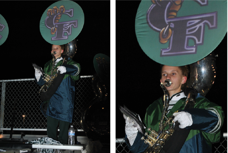
Use and apply the Rule of Thirds. Imagine your viewfinder is divided into three rows and three columns. Your main action should land where the lines of your rows and columns intersect. These are called hot spots. If you’re having a hard time with the Rule of Thirds, check the settings on your camera. Many of them have a Rule of Thirds display on your viewfinder. At the very least, just remember not to center your subject.
Get low, look up. Pay attention to where and how professional photographers have positioned themselves during sporting events. Most of the time, they are squatting or kneeling on the sidelines. This fills the frame with the athlete, includes faces, and makes the action seem even bigger and more intense.
Take one (or five) giant steps to the right. Too many photographers aim dead on, taking an image dead on front or dead on side. When you square off or profile the subject, you leave a lot of white space. Use an angle to get more depth. Bonus: you’re likely to get a clearer image of the face!
Turn the camera. Remember to take vertical shots, too!
Know the need. Most importantly, know your subject and know what kind of photo you want. Talk to your editors, writer and designer (assuming they’re not you). It’s going to matter to them if it’s a vertical or horizontal image, if the action is moving right or left, and where negative space is. Work together and be patient. Take the time to plan and seek out the compositions that best tell your story. Remember, you may take 700 random photos of a football game, but you only need one dominant photo. Quality far surpasses quantity.
Placing photos for impact
Just like you edit down your articles to fit the space while still telling the most powerful story possible, you want to showcase your photo without any distracting elements. Placing a photo on your spread is also a time when you can correct the mistakes of the photographer and showcase the subject.
Face it, you have to think about a lot of different things when you’re taking a photo, especially an action photo. So shoot the action, get it in the can, and compose it back in the yearbook room. Take photos at the highest quality and resolution possible to give you the greatest option when it comes to scaling your photos.
Whatever is most important should be big. This is true of your dominant photo of course, but don’t forget secondary coverage. These photos run an even greater risk of blending into the background if you don’t show them off. In a yearbook, faces are the most important part of the photo 99% of the time. Make sure they stand out on a page.
 A little lost on what and where to cut out of a photo, such as arms, feet and entire bodies? Here’s a guide (not carved in stone, just a guide) to get you started as you develop your artistic and storytelling eye.
Crop your subjects close, but don’t mangle them. There are certain parts of the body that are OK to cut out of a photo, and others are not.
Top of the head:
Crop it! It’s called “close cropping” and it’s a major trend right now because it looks so awesome. Getting so close to your subject that you can’t see the top of the head conveys an openness and intimacy that indicates good storytelling. Just try to leave the hairline. That’s the part that really frames the face and is unique to the individual.
Neck:
Don’t crop it! No disembodied heads, please. They are not OK. At least show a little of the shoulder curve. That anchors them and makes them seem real – less like a prop in a horror movie.
Bustline and the waist:
Crop away. These are the two most common places to end an image, because they work. Use them liberally.
Thighs and knees:
Ooooh, a tricky one! It’s OK to crop at mid-thigh or at the knee, but it’s certainly not optimal. Play it by ear. Go for it in the camera, but be prepared to zoom in to crop at the waist when placing on the layout. Thighs and knees should be decided on a case-by-case basis.
Shins:
Crop them out. No shins, unless there is something distinctly storytelling about the shins. The problem is: to include the shins, means the face has to be really small. Which is more important? Also, don’t crop mid-shins. Knee or waist is better.
Feet and hands:
Don’t crop them out. Hands are expressive and arms tend to be leading lines. As the “readers” of a photograph, our eyes move from the face down the arm to see what the hands are up to. No hands is creepy and disappointing. Same deal with the feet. Traditionally, we need feet for standing. If we see everything but the feet, it’s a little scary. Whether you think about the reason or not, you won’t like the photo.
Comments are closed.

